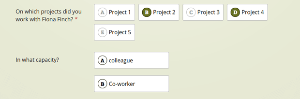
Multiple choice
The multiple choice component can be used whenever you want you user to pick one or more items out of multiple choices. This make this component functional similar to the checklist, but it’s distinct design will surely grab the attention.
Also the multiple choice answers can be selected by clicking the item directly or by pressing the keyboard letter that represents the item.
Properties
The multiple choice component has the following properties:
Label
In other words; your question.
Orientation
The multiple choice items can be presented in a vertical or a horizontal order.
Selection limit
This number indicates how many items can be selected by your user.
- When the limit is set to one only one item can be selected, selecting a different item will automatically deselect the other.
- When the limit is set to two or more, all other items will be grayed out when the selection limit is reached.
Items
The options you want your user to choose from.
Mark as required
Turning this option on will require the user to select at least 1 item regardless off the selection limit.