Form settings
A form has multiple settings. In the article we will explain the options that are available to you and the differences between them.
Name
When you create a form you have to give your form a name. This name can be changed to anything that best describes your form.
Please note that if you change the name of a form you are receiving form submission email notifications from, and you have made email rules in your email client, these rules might have to be adjusted to include the correct form name.
Description
The description field is purely for your own convenience and can be used to make notes about the form. For example: we use this field to specify on which webpage we have embedded the form.
Select Theme
This button lets you change the theme that is applied to a form. You can learn more about changing a form theme in our article.
Label Position
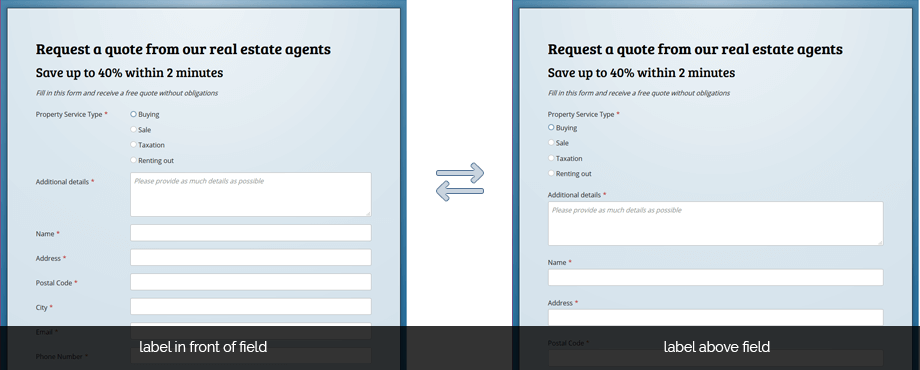
Regardless of the theme that is applied to your form, this property lets you determine the label position. This can be set to display the label (you question) above or in front of the fields (the answer).

Please note that on small screens, the label will always be positioned above the field. In the form designer this can happen when the width of the canvas reaches that same breakpoint.
Therefore, if you don’t notice a change when you have changed this setting your screen is probably to small for the designer to correctly display it, because of the extra interface elements. This occurs on screen sizes which have a effective width that is smaller than 1701px with the menu open or 1401px when the menu is collapsed.
Your form will look the way you intended once you publish it and view it on a desktop or larger tablet screens.