Action Bar
The action bar consists of 1 or multiple buttons. You can choose between various predefined actions to decide what happens when someone presses the buttons. It is, for example, possible to use these buttons to navigate between form pages. This way you can add form navigation on the top off each page in addition to the default navigation buttons on the bottom.
Another use case for the action bar is to use the buttons to first submit the form data and then navigate to an external URL. Because you can specify a different URL per button you could therefore use this to offer multiple download links. For example when you offer a free ebook when someone subscribes to your newsletter or maybe desktop images on different resolutions.
Differences between Action Bar & Submit Button
The differences between the action bar and the submit button component are:
| Action Bar | Submit Button |
|---|---|
| action: Previous page | n.a. |
| action: Next page | n.a. |
| action: Submit and go to external url | action: (Submit and) go to external url |
| action: Submit and go to thank you page | action: (Submit and) go to thank you page |
| Multiple buttons | 1 button |
Differences Between the Action Bar & Default Navigation Buttons
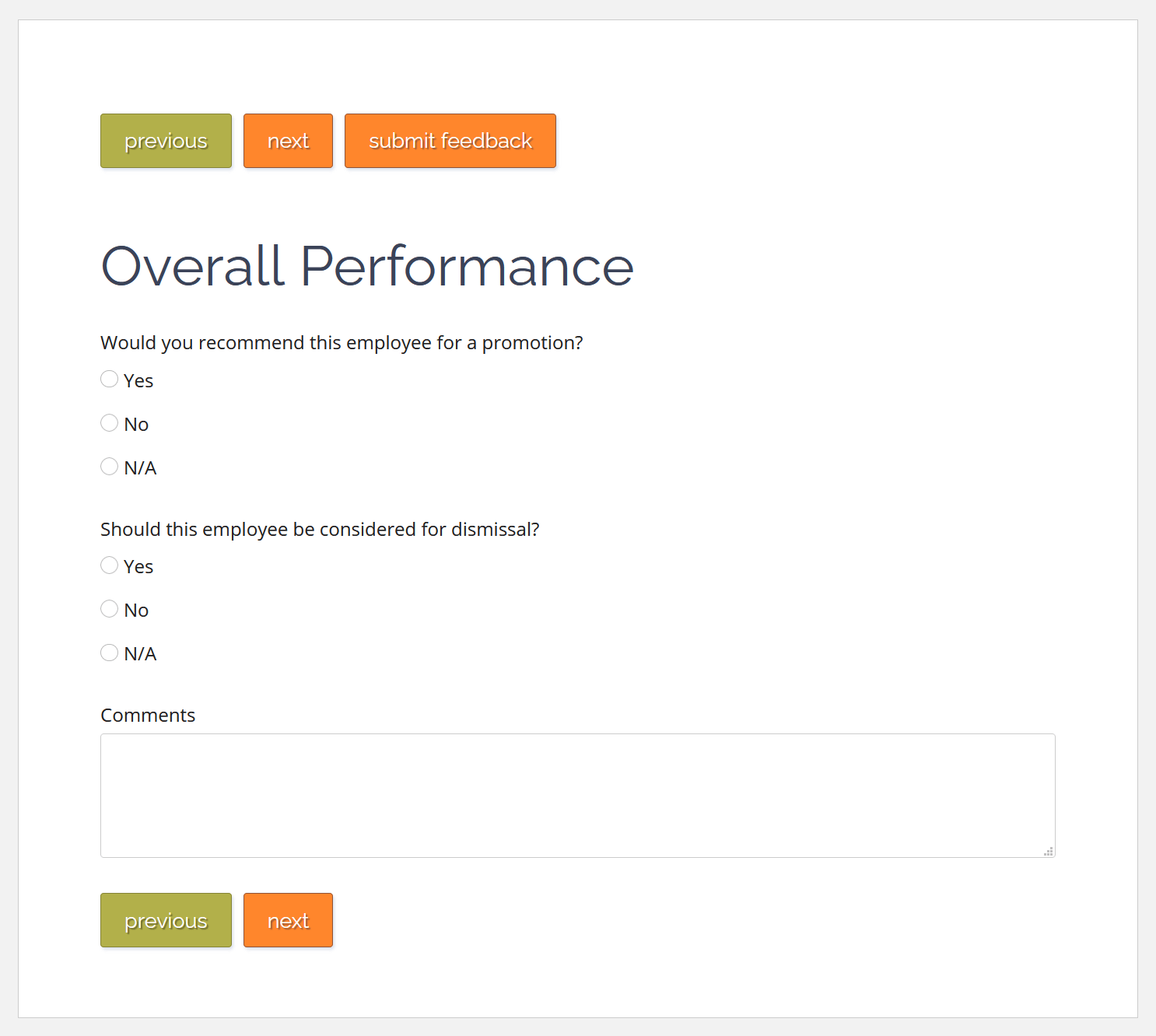
The default buttons on the bottom of every form (page) automatically adjust to the form design. Because they are aware of which page they are positioned on and the total number of form pages, they also know what they should do. For example form page 1 has a next page, page 2 a next and previous button and page 3 a previous and submit button.

Above: A form with an action bar (upper button row) as well as the default navigation
Contrary to the default buttons the buttons within an action bar component have no contextual information. Therefore you should only place next, previous and submit buttons if you actually want them to be available on that form page.
Properties of the Action Bar Component
Per button on the action bar you can assign the following properties.
Caption
The text that should be displayed on the button. We recommend that you use verbs for this text because multiple user studies indicate that buttons that use verbs are easier to comprehend. You could for example use words like: register, apply now, send, submit or subscribe. Try to avoid terms like OK.
Delete Button
Next to the button text input field you find a button with a trash can icon. You can use this to delete a specific button and its properties. This won’t affect other buttons within the same action bar.
Action
What should happen when you press a certain button:
| Choice | Action |
|---|---|
| Previous Page | The user will navigate to the previous page, provided there is one of course. |
| Next page | The user will navigate to the next page, provided there is one. |
| Submit and go to external url | The form input will be validated and submitted after which the user will be redirect to an external url (see: Extra Properties on: "Submit and go to external url"). |
| Submit and go to thank you page | The form input will be validated and submitted after which the user will be redirect to the thank you page. It is also possible to edit the contents of the thank you page (see: Extra Properties on: "Submit and go to thank you page"). |
Extra Properties on: "Submit and go to external url"
Website address
Here you can specify where the user must be redirected to once they submit the form. Please specify the entire url starting with https://www.
Extra Properties on: "Submit and go to thank you page"
Customize thank you page
By default the thank you page is a simple page with a short default text that thanks the user for submitting the form. You can edit the contents of this page by turning this option on, which will make the following properties editable:
Title
The title of the thank you page
Message
The text you want to display.
Website address
If you want to provide a link, for example to your own website or social media page, you can add that here.
Website text
If you prefer to display an alternative text for the link instead of the full website address you can add that text here. For example: back to homepage.
Add button
When you press this button you will add another button within the action bar, with its own set of properties. Keep in mind that the extra buttons will be added left to right on the form.