Likert
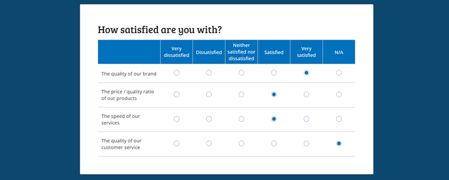
With a Likert, or Likert scale, you can easily gauge to what extent respondents agree with certain statements. The answers that the respondent can choose from consists of a scale that you specify, such as:
- Very dissatisfied
- Dissatisfied
- Neither satisfied nor dissatisfied
- Satisfied
- Very satisfied
- N/A
In addition, you can also use the Likert to measure the frequency in which something occurs by presenting different situations where 1 or more fixed answers are possible per situation:

For more information and examples, also read the blog article: New Component: Likert Scale.
Properties
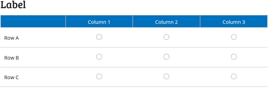
The Likert component has various properties. To clearly mark the different parts of the Likert, you can see in this image where they are positioned:

Label
The component label is the place where you can define your overarching question. For example: "To what extent do you agree with the following statements".
Columns
The available answers that are available to the respondent. The default values are:
- Strongly Disagree
- Disagree
- Neutral
- Agree
- Strongly Agree
Tip: If you plan to make the question mandatory, it is advisable to offer a neutral option and / or add the option “no opinion / not applicable”.
The minimum number of columns is 3. If you think you need fewer columns, we recommend that you use another component such as:
Rows
The rows are the questions or statements that the respondent must answer. The minimum number of rows is 3, if you need fewer rows we recommend that you consider the following components:
There is no limit to the number of rows you can add.
Tip: To ensure your forms readability, you can consider dividing the rules over multiple pages and / or Likert scales.
Min. and Max. Selection
With this property you can set how many choices have to be made per line. By enforcing at least 1 choice, you make the question mandatory. If you allow a maximum of more than 1 choice, FormFinch will automatically convert the default radio options from the Likert to check marks in order to signal to the respondent that multiple options are possible (also called affordance).
Submissions
If your form contains a Likert, it will take up one column per row in your submission overview. This ensures that your submission overview won’t get cluttered and can be easily processed.
Particularities
The Likert is a component that works best on larger screens. We've made Likert as mobile-friendly as we can so it won't affect your submissions. However since the tablet / desktop version is more user friendly, which helps to keep the bounce rate low, this component will ignore the label position setting of your form and will always be shown below the label.